If your diagrams look “busy” or hard to scan, it’s rarely a tool problem—it’s color discipline and layout structure. After coaching dozens of teams, I’ve found that a compact palette, consistent spacing, and clear flow conventions do 80% of the visual heavy lifting. Below is a field-tested playbook you can apply in minutes.
1) Build a compact, role-based color system
Professionally styled diagrams treat color as a system, not a decoration. Keep the working palette tight and assign each color a job.
- Start with 6–8 total colors:
- 2–3 neutrals for text, strokes, and backgrounds (e.g., near-black for text, light gray for canvas).
- 1–2 accent colors for emphasis (primary route, key nodes).
- 2–3 semantic colors for states (e.g., success/ok, warning, error). Use these sparingly.
- Follow design-system roles: neutrals do most of the work; accents highlight; semantics signal meaning. This mirrors the role model used in modern systems like Material 3—see the concise breakdown of roles in the Material Design 3 color roles (Google, current as of 2025).
- Set contrast targets up front:
- Normal text should meet 4.5:1 contrast; large text or non-text graphics should meet at least 3:1. These thresholds, defined in the W3C WCAG 2.2 contrast criteria, keep labels readable on light fills and connectors visible against the canvas.
- Make it CVD-friendly: about 2–5% of people have some color vision deficiency. A 2025 meta-analysis estimates global prevalence around 2.59% overall, higher among males. Plan palettes that avoid red–green dependence and rely on lightness/contrast differences, as summarized in the 2025 color vision deficiency meta-analysis (PubMed indexed).
Practical setup recipe
- Pick a very light neutral background and a dark neutral for text/strokes (e.g., #111 for text, #F8F9FA canvas).
- Choose one primary accent (e.g., blue) and a secondary accent (e.g., teal or purple). Keep both moderately saturated.
- Choose semantic tones that are darker and contrast-friendly (e.g., deep green, amber, red). Avoid neon pastels for text-containing shapes.
- Test critical pairs (text vs. fill, connector vs. canvas) in a contrast checker. Adjust until minimums are met.
When to deviate
- Dense maps (e.g., network diagrams) may need an extra neutral variant; still avoid rainbow spreads.
- If your brand mandates specific hues, adjust lightness and saturation (not just hue) to hit contrast targets.
2) Lay out for effortless reading
Great layout is mostly rhythm and restraint. Use a base unit and repeat it relentlessly.
- Pick a spacing unit: 4 px or 8 px. Use multiples for gaps between nodes, between rows/columns, and around groups.
- Align by edges and baselines: turn on snapping; keep left edges in a column perfectly aligned. Even 2–3 px drift reads as sloppy.
- Keep a vertical rhythm: for example, 24 px between rows of tasks; 32–40 px before/after gateways to reduce line crossings.
- Manage width: constrain node widths to a set of sizes (e.g., 200 px or 280 px columns) so reading feels predictable.
- Use whitespace to show grouping: leave generous margins around clusters; visually separate lanes or sections with consistent gaps.
- Control crossings: prefer top-to-bottom or left-to-right flow; use elbows and jump-overs deliberately; avoid needless backtracking.
Why this works
- Predictable spacing and alignment create a strong visual hierarchy and reduce cognitive load—principles long validated in UX research. For a concise overview of how hierarchy guides scanning, see the NN/g visual hierarchy explainer (Nielsen Norman Group, ongoing reference).
3) Quick ProcessOn workflow: color and layout in practice
Here’s a simple, repeatable routine I use to go from messy to professional in minutes using ProcessOn.
Establish the canvas
- Set a very light canvas color and increase the default connector stroke to a darker neutral to hit 3:1 contrast.
- Turn on grid/snapping. Choose 8 px as your base (or 4 px for smaller diagrams).
Define your palette
- Create style presets: one neutral node style for “normal,” one primary-accent style for “main path,” and one secondary-accent style for “alternate.”
- Add semantic styles for exceptions (amber) and issues (red). Keep labels in a dark neutral for readability.
Normalize typography
- Use one font family with two weights (regular/bold). Set 12–14 pt for labels depending on output size. Reserve bold for headers or key nodes.
Build the grid
- Lay out columns with consistent widths (e.g., 240 px). Use equal gaps between columns and rows (e.g., 32 px).
- Align by left edges; nudge nodes so the baseline of labels line up across rows.
Route connectors cleanly
- Favor 90-degree elbows; avoid diagonal spaghetti. Keep entry/exit points consistent (e.g., exits from right, entries from left).
- Increase spacing around decisions to reduce crossings; if a cross is unavoidable, use a jump-over style for legibility.
Apply emphasis sparingly
- Use the primary accent only on the critical path nodes and their connectors. Everything else stays neutral.
- Use the secondary accent for secondary flows or annotations.
Run a contrast and spacing pass
- Check any text-on-fill pairs against contrast thresholds from WCAG 2.2. Darken text or lighten fills if needed.
- Scan for misalignments; fix 1–2 px drifts. Remove decorative lines/gradients that don’t convey meaning.
Final export check
- Zoom to 70% and 200%—the diagram should remain readable at both ranges.
- If presenting, test on a projector theme (often lowers contrast) and adjust.
Note: For foundational flowchart structure and symbol choices, the ProcessOn Flowchart Guide is a solid companion to these styling techniques.
4) Symbols, labels, and conventions that signal professionalism
- Use standard symbols consistently. In process models, BPMN is widely recognized: events (circles), activities (rounded rectangles), and gateways (diamonds). The Object Management Group’s specs clarify when to use sequence flows (solid arrows) versus message flows (dashed lines with open arrowheads). If you work with cross-team processes, following the OMG BPMN specification overview (OMG, current spec line) prevents misinterpretation.
- Label tasks with concise verb–object phrases: “Validate order,” “Generate invoice,” “Notify customer.”
- Keep flows within swimlanes; label pools/lanes clearly. If a line would cross multiple lanes, re-evaluate layout before adding visual noise.
- Use off-page connectors or annotations instead of forcing long backtracks.
If you’re modeling full business processes, you’ll find additional structuring tips in the Business Process Diagram tutorial, which pairs well with the styling practices here.
5) Collaboration that improves quality without derailing schedules
In practice, the fastest way to a polished diagram is a short, structured review loop.
Self-check pass (3–5 minutes)
- Palette size ≤8; accents used sparingly.
- Contrast: text 4.5:1; connectors 3:1 against canvas.
- Spacing: consistent multiples of your base unit; no jitter.
- Labels: verb–object, no line breaks if possible; abbreviations explained once.
Peer review pass (10 minutes)
- Ask a colleague unfamiliar with the flow to narrate the path. Anywhere they hesitate, adjust spacing, labels, or connector routing.
- Capture comments in one place and iterate once. One focused pass beats five diffused micro-edits.
Why tighten reviews?
- Clear visuals measurably improve comprehension and decision speed. For example, research synthesizing how visuals support both fast and analytical reasoning found improvements in decision outcomes when visuals reduce cognitive load; see the overview in Padilla’s 2018 decision-making review (PNAS/PMC).
6) Common mistakes and the quick fixes that actually work
Too many colors (rainbow effect)
- Fix: cap to 6–8 colors; switch most nodes to neutral fills; reserve one accent for the main path.
Low-contrast labels on colored shapes
- Fix: darken text, lighten fills, or add a light neutral label chip behind text to meet 4.5:1.
Jittery alignment and uneven spacing
- Fix: enable snapping; align by edges; choose a base spacing unit (4 or 8 px) and standardize gaps.
Spaghetti connectors and crossings
- Fix: left-to-right or top-to-bottom convention; add space around decision nodes; use elbow connectors and jump-overs for the few unavoidable crossings.
Color meaning without redundancy
- Fix: pair color with labels, icons, or border patterns. This also improves CVD accessibility.
Overstuffed text blocks
- Fix: rewrite to verb–object and split long notes into numbered callouts or a side legend.
Inconsistent node sizes
- Fix: define 1–2 standard widths for columns and stick to them; resize outliers.
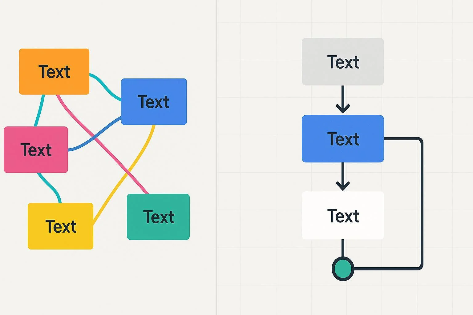
7) Before/After transformation (described)
- Before: a flowchart with 12+ colors, mixed fonts, and nodes drifting by a few pixels; connectors diagonally crisscross; labels like “Handle it” lack clarity.
- After: the same flow uses a light neutral canvas, dark neutral text, and a single accent for the critical path. Nodes align to a 240 px column grid with 32 px gaps. Connectors route at 90 degrees, with extra space around decisions to avoid crossings. Labels switch to crisp verb–object phrases. The result reads left-to-right in a single glance.
If you’re building spatial diagrams such as floor plans where layout clarity is paramount, this spacing discipline pairs well with the guidance in the Floor plan drawing overview.
8) Accessibility essentials you shouldn’t skip
- Contrast standards: follow 4.5:1 for normal text and 3:1 for larger text and non-text graphics per the W3C WCAG 2.2 contrast guidance. Don’t rely on color alone—use labels, icons, or patterns for meaning.
- CVD-friendly hues: prefer blue–orange or blue–red contrasts over red–green pairs; differentiate by lightness and saturation; sanity-check in grayscale. The prevalence data noted earlier (2025 meta-analysis) is a reminder that inclusive choices matter.
- Projection and dark-mode tests: preview on bright projectors and dark backgrounds; raise contrast and adjust neutrals accordingly.
9) Ready-to-use checklist (print this)
Color
- Working palette ≤8 colors; heavy use of neutrals
- One primary accent for critical path; one secondary accent if needed
- Semantic colors reserved for exceptions/states
- Contrast: text 4.5:1; non-text/large text 3:1 (WCAG 2.2)
- CVD-safe: avoid red–green dependence; add labels/patterns
Layout
- Base spacing unit selected (4 or 8 px) and used consistently
- Columns set (e.g., 200–280 px) with equal gaps between rows
- Edges and baselines aligned; no jitter
- Connectors mostly 90-degree; crossings minimized or jump-over styled
- Whitespace groups related elements and separates sections
Conventions & labels
- Standard symbols used (e.g., BPMN/ANSI) and lanes labeled
- Verb–object task names; abbreviations clarified
- Off-page connectors used instead of long backtracks
Collaboration
- Self-check pass complete; peer review pass complete
- Single round of consolidated comments addressed
- Final export tested at 70% and 200% zoom; projector preview ok
Further learning within ProcessOn’s ecosystem
- For structure fundamentals and symbol usage, see the ProcessOn Flowchart Guide and the Business Process Diagram tutorial. For spatial layout discipline applied to non-flow diagrams, the Floor plan drawing overview is a useful complement.
References for deeper standards and evidence
- Color roles and discipline: Material Design 3 color roles (Google, current as of 2025)
- Contrast and accessibility: W3C WCAG 2.2 contrast guidance (W3C, 2023–2025)
- Visual hierarchy and scanning: NN/g visual hierarchy explainer (Nielsen Norman Group)
- Professional conventions for processes: OMG BPMN specification overview (Object Management Group)
- Why visuals improve decisions: Padilla 2018 decision-making review (PNAS/PMC)
- Color vision deficiency prevalence: 2025 CVD meta-analysis (PubMed)